# Finding the Right Colors That Actually Connect Us to Nature
Oh man, let me tell you about my first disaster with trying to bring nature colors into my living space. I’d just started getting into this whole biophilic design thing after reading an article about how certain colors can actually lower stress levels. So naturally, I march into Home Depot with zero plan, grab the brightest forest green I can find, and paint my entire bedroom. I mean, green equals nature, right?
Wrong. So incredibly wrong. I spent exactly two nights in what my roommate called “the inside of a shamrock” before admitting defeat and repainting everything white again. Cost me $127 in supplies and a whole weekend, but it taught me something crucial – the colors that actually connect us to nature aren’t the cartoon versions we think of when someone says “tree” or “grass.”
The real breakthrough came about six months later when I was sitting in this coffee shop in Portland that just felt… different. Couldn’t put my finger on why, but I kept finding excuses to work there instead of at home. One day I started really looking at the space instead of my laptop. The walls weren’t any single color I could name – more like this complex grayish-green that shifted depending on the light. The wood tables weren’t brown exactly, but this warm honey tone with darker grain running through. Even the concrete floor had these subtle variations that reminded me of river stones.
I started taking photos (probably looked like a weirdo documenting a coffee shop, but whatever) and comparing them to nature pics on my phone. That’s when it clicked – real nature colors aren’t flat or uniform. They’re layered, complex, constantly changing as light moves across surfaces.
There was this documentary I watched called “The Science of Color” that explained why we respond so strongly to certain hues. Turns out our brains have literally evolved over millions of years to find healthy natural environments calming. When we see the soft blues of clear water or the varied greens of thriving plants, our nervous systems actually relax – heart rate slows down, stress hormones decrease, the whole deal. It’s not just aesthetic preference, it’s biology.
I started keeping track of how different colors affected my mood (yes, I’m that person who tracks everything in spreadsheets). My sleep improved dramatically after I painted my bedroom this soft sage color I found by mixing three different paint samples. My tiny home office, done in what I call “mushroom gray” with warm wood accents, consistently correlates with my best writing days. Even my partner noticed I seemed less anxious after switching our harsh white kitchen walls to this creamy beige that reminded me of sand dunes.
But here’s what gets really interesting – the specific colors that work best vary hugely based on where you grew up. I read about this study where researchers found that people from coastal areas responded most positively to blues and sandy tones, while folks from mountain regions preferred stone grays and deep evergreens. Makes perfect sense when you think about it. I grew up in the Pacific Northwest, so my ideal nature palette leans heavily toward those deep forest greens and rich browns of old-growth trees.
That insight completely changed how I approach color choices now. Instead of thinking generically about “nature colors,” I try to identify what specific landscapes make me feel most peaceful. For me, it’s definitely old forests – that mix of filtered green light, weathered bark, and mossy ground cover. But my sister, who spent her childhood summers at our grandparents’ place in Arizona, gravitates toward warm terra cottas and sage greens that echo desert plants.
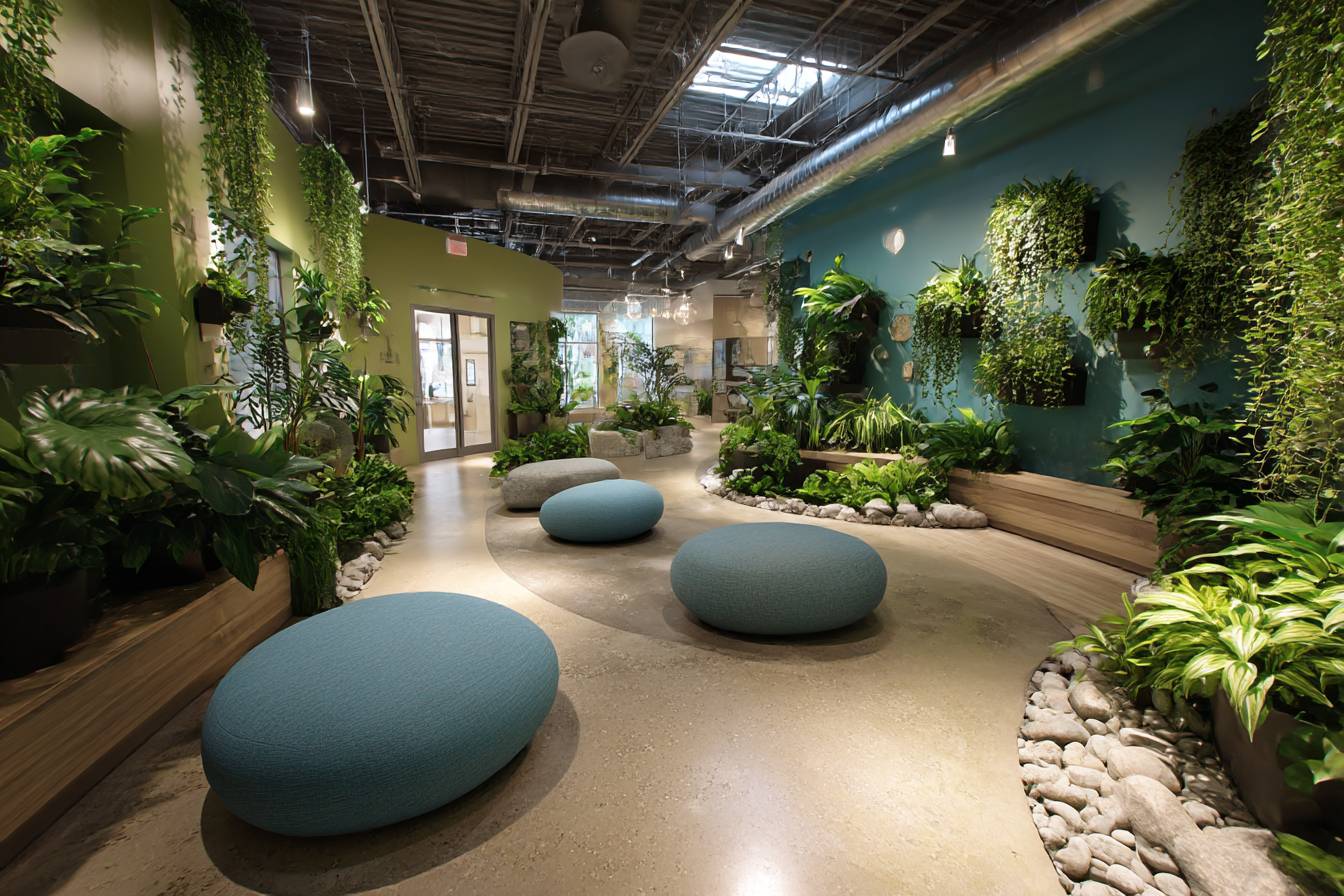
Green still forms the foundation of most nature-inspired color schemes, and there’s solid science behind why. Our eyes actually have more receptors for green wavelengths than any other color – another evolutionary adaptation that helped our ancestors spot healthy vegetation and safe places to settle. But not all greens work the same way indoors. I’ve learned through plenty of trial and error (and more repainting than I care to admit) that slightly muted or grayed greens create much better balance than pure, saturated versions.
The emotional temperature of green matters too. Cooler greens with blue undertones – think eucalyptus or sage – create these calm, contemplative feelings that work perfectly in bedrooms or anywhere you want to unwind. Warmer greens with yellow undertones feel more energizing and social, which is why they work so well in kitchens or living areas where you want people to feel engaged and lively.
I helped my neighbor redo her home office last year, and we chose this particular blue-green that reminded her of swimming in lakes as a kid. She swears her Zoom calls go better now because the color makes her feel more grounded and confident. Whether it’s psychological or just coincidence, she’s definitely seemed more relaxed lately.
Brown gets seriously underrated in discussions about nature-inspired color palettes, but it’s absolutely essential for creating that grounded feeling. Think about it – every natural environment has some version of brown anchoring everything else, whether it’s soil, tree trunks, or stone. Without brown, other colors can feel floaty or disconnected from earth.
The trick with brown is choosing versions with enough complexity to feel alive rather than muddy. I look for browns with red undertones (like rich chocolate or warm chestnut) or those with slight gray influences that echo weathered wood. Pure flat brown feels dead, but complex brown feels like actual earth.
I’ve gotten really into collecting nature photography that captures sophisticated color relationships – the way morning light shifts from golden to silver, how water reflects surrounding colors, all those subtle variations you see in a single fallen leaf. These images become both inspiration and reference points when I’m trying to recreate that complexity in interior spaces.
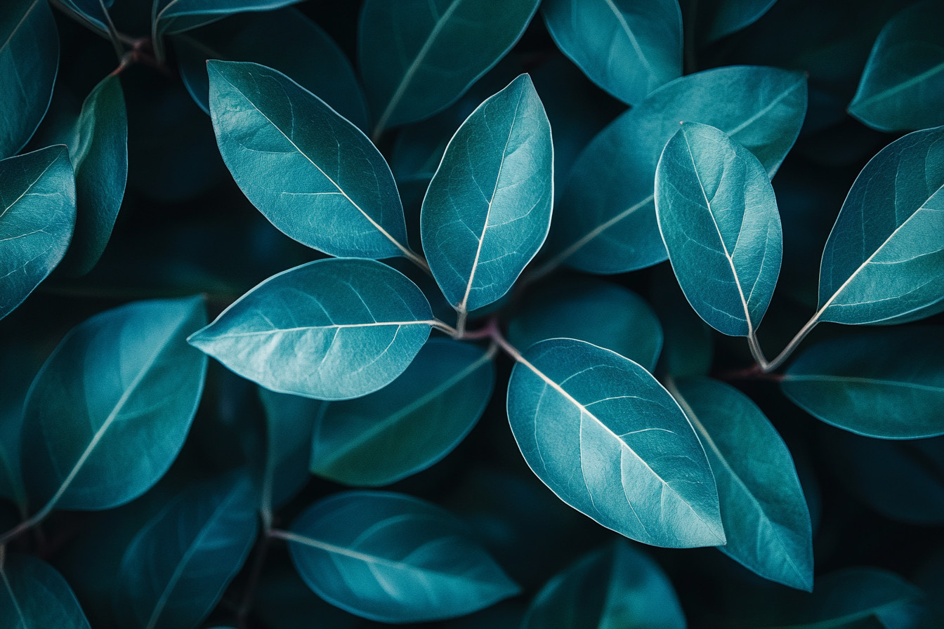
Water colors deserve special attention because they trigger such deep psychological responses. The blues and blue-greens we associate with clean water make us feel safe and abundant on some primal level. But again, it’s about complexity. Real water is never just one flat blue – it contains reflections, mineral content, all these subtle variations that keep it feeling alive and interesting.
I use water-inspired colors more as accent tones than dominant hues. A blue-green throw pillow here, some ceramic pieces there, maybe artwork that captures that shifting quality of light on water. Too much and it can feel cold, but just enough creates this sense of freshness and movement.
One thing I’m getting more interested in is how to incorporate seasonal color changes. Nature doesn’t stay static – forests shift from spring’s bright greens to summer’s deep emerald to autumn’s golds and crimsons, then winter’s subtle grays and browns. I’ve started experimenting with ways to echo this in my apartment through changeable elements like throw pillows, artwork I rotate, even smart bulbs that shift color temperature throughout the year.
Lighting absolutely makes or breaks how these colors actually appear in your space. Natural light changes constantly throughout the day, revealing different aspects of color that cheap artificial lighting often flattens completely. I always test color choices at different times and under various lighting conditions before committing to anything. That sage green that looks perfect in morning sun might turn gray and depressing under evening fluorescents.
The psychological impact of getting these colors right goes way beyond just liking how something looks. There was this article I read about a hospital that redesigned their children’s ward using nature-inspired colors, and they saw significant decreases in patient anxiety and faster recovery times. My friend who’s a teacher says her students are noticeably calmer since she painted her classroom this soft blue-gray that reminds her of misty mornings.
Material selection plays a huge role in how authentic these color relationships feel. Natural materials like wood, stone, and linen display color differently than synthetic alternatives. They absorb and reflect light in complex ways that add depth and interest to color palettes. A piece of weathered cedar brings browns and grays that no paint chip can fully replicate. Natural fiber rugs contain color variations that make solid-colored synthetic versions look flat and lifeless by comparison.
I’m fascinated by how traditional cultures intuitively understood these principles long before anyone coined the term “biophilic design.” Japanese architecture creates these incredibly sophisticated color relationships using natural wood tones and carefully selected accents that echo seasonal changes. Southwestern adobe buildings incorporate the exact earth tones of their surrounding landscape. These traditional approaches offer so much inspiration for contemporary nature-inspired design.
One pattern I’ve noticed through years of experimenting is that the most successful nature-inspired spaces include both warm and cool tones, just like actual natural environments. A forest contains cool blues and greens in shadowy areas alongside warm golds and browns where sunlight hits bark and earth. This temperature balance prevents spaces from feeling monotonous or emotionally flat.
Texture affects color perception in ways that are particularly important when you’re trying to recreate natural complexity. Rough textures make colors appear darker and more grounded, while smooth surfaces reflect light and brighten colors. I use this principle to create visual interest within limited color palettes – varying texture to create the kind of subtle complexity you see in natural settings.
The whole goal isn’t to recreate nature exactly, but to capture its essential emotional and psychological qualities through thoughtful color relationships. When I get it right, people consistently comment that a space feels peaceful, or energizing, or just somehow “better” without being able to identify exactly why. That’s the power of colors that actually connect us to nature instead of just representing our cartoon ideas about what nature looks like.
As I keep learning about this stuff, I’m struck by how much we’re still discovering about the connection between color, emotion, and our innate need for natural elements. Every project teaches me something new about how subtle color choices can dramatically impact the way spaces feel and function. It’s way more complex than just picking pretty colors – it’s about understanding our biological responses and creating environments that support rather than stress our nervous systems.
Jeff writes about bringing bits of nature into everyday living spaces — not as a designer, but as a curious renter who experiments, fails, and keeps trying again. He shares what he’s learned about light, plants, and small changes that make big differences for real people living in ordinary apartments.