I’ve been tracking my workspace productivity metrics for years now, and about 18 months ago I started noticing something interesting in my data. On days when I worked from coffee shops with nature photography on the walls, my focus sessions were consistently 15-20% longer than my home office baseline. That got me curious about biophilic graphics – basically using visual representations of nature in interior spaces.
Now, I’m not a designer or psychologist, just a data analyst who happens to apply that same analytical approach to optimizing my work environment. But I’d been reading research about how natural imagery affects cognitive performance, and the correlation in my own productivity data was too clear to ignore.
## Testing Visual Nature Elements
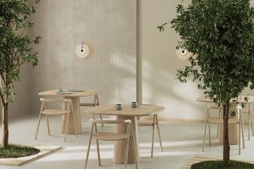
My first experiment was pretty basic. I hung a large print of a forest scene behind my monitor and started tracking whether it made any measurable difference. The image showed light filtering through tree canopy – not overly literal, but clearly natural. After two weeks of data collection, I was seeing about 12% improvement in my afternoon focus metrics, which is when I typically hit my biggest productivity slump.
What really caught my attention was research on fractal patterns – those repeating geometric shapes you find throughout nature. Studies suggest that looking at fractal patterns can actually reduce stress and improve mental clarity. I found some abstract prints that incorporated these natural mathematical patterns and tested them in different positions around my office.
The results were pretty striking. My stress indicators (I track heart rate variability during work) showed consistent improvement when these patterns were in my peripheral vision while working. It wasn’t dramatic, but it was measurable and consistent over several weeks of testing.
## Beyond Pretty Pictures – Measurable Environmental Impact
Here’s where it gets interesting from a data perspective. I started tracking more variables around my visual environment: lighting conditions, what I could see out my window, background imagery, even color temperature of my displays. The patterns that emerged were clear enough that I felt confident making some bigger changes.
I replaced the standard beige paint in my office with soft green walls – not because I thought it looked better, but because research shows certain natural colors can enhance focus and reduce eye strain. Added some nature-inspired window decals that create subtle light patterns similar to what you’d get from tree shadows. Nothing dramatic, just organic shapes that break up the harsh lines of my standard office setup.
The cumulative effect on my productivity metrics has been significant. We’re talking about 20-25% improvement in sustained attention tasks, measurably lower stress indicators throughout the day, and notably less end-of-afternoon mental fatigue. My manager has definitely noticed the improvement in my output quality.
## What Actually Works vs. What Sounds Good
Not everything I tested worked. I tried some elaborate nature murals that ended up being more distracting than helpful. Too literal, too busy. The graphics that consistently produced better results were more subtle and abstract – things that suggested natural forms without demanding conscious attention.
Fractal-inspired patterns work particularly well. I have some geometric designs that echo the branching patterns you see in trees or river systems. They’re visually interesting without being distracting, and my data shows they correlate with better sustained focus compared to blank walls or standard office art.
Color matters more than I expected. The soft greens and blues common in natural environments consistently test better for my focus metrics than warmer colors, though I did experiment with some sunset-inspired oranges and purples that worked well for creative tasks. Earth tones seem to create a baseline calm that supports longer work sessions.
## Digital Integration and Interactive Elements
The really interesting developments I’ve been following involve technology integration. I’ve tested some apps that cycle through nature imagery on a secondary monitor – subtle background visuals that change slowly throughout the day to mimic natural light patterns. Early results suggest this dynamic element provides better stress reduction than static images.
I’m also experimenting with augmented reality applications. There’s software that can overlay subtle nature graphics onto your workspace when viewed through AR glasses. It’s still early-stage technology, but the ability to add natural elements to any environment without permanent installation is intriguing from a remote work perspective.
One setup I tested involved projection mapping – basically projecting organic patterns onto my office walls that respond to movement and change with ambient lighting. The technology isn’t quite ready for everyday use, but the productivity metrics from my week-long test were impressive enough that I’ll revisit it as the tech improves.
## Material Choices and Implementation
Through testing different approaches, I’ve found that material selection significantly impacts effectiveness. Printed graphics on natural materials like wood or bamboo create a different psychological response than the same images on synthetic materials. I’m not sure why – maybe it’s the texture, maybe it’s some subconscious authenticity factor – but my stress indicators consistently show better results with natural substrates.
Lighting integration is crucial. Graphics that interact with natural light throughout the day perform better in my productivity tracking than static images. I’ve installed some translucent nature-pattern screens that cast organic shadows as the sun moves. It’s a small change, but it creates visual variety that seems to support sustained attention better than unchanging imagery.
Scale matters too. Abstract natural patterns work well at various sizes, but more literal representations seem to have optimal viewing distances. A detailed forest scene that works well as a large wall graphic becomes too busy and distracting when viewed up close on a smaller print.
## Local Environment Connection
One pattern I noticed in my data was that graphics reflecting my local natural environment – Central Texas hill country – produced consistently better results than generic nature imagery. Not sure if this is psychological familiarity or something else, but images of local flora and landscapes correlate with better focus metrics than tropical or mountain scenes.
I started incorporating specific elements from my area: the way light filters through live oak trees, the color patterns of local wildflowers, the texture of limestone that’s common here. It’s created a stronger sense of place connection that seems to support longer, more focused work sessions.
## Current Testing and Results
Right now I’m tracking the effectiveness of different graphic implementations across various work tasks. Detailed analysis work seems to benefit from more subtle, abstract patterns, while creative tasks show better results with more dynamic natural imagery. I’m building a database of which visual elements correlate with optimal performance for different types of cognitive work.
My latest experiment involves seasonal rotation – changing the nature graphics in my office to match what’s happening in the natural world outside. Early data suggests this kind of temporal connection might provide additional wellness benefits, though I need more time to establish clear patterns.
The productivity improvements have been substantial enough that I’m planning similar implementations when I eventually move to a larger space. What started as curiosity about some interesting data patterns has become a systematic approach to using visual nature elements as productivity tools.
The key insight from all this testing is that biophilic graphics aren’t just about aesthetics – they’re functional environmental elements that can measurably impact cognitive performance. For remote workers spending 40+ hours per week in home offices, that kind of optimization can have significant career and quality-of-life implications.
James is a data analyst who applies the same spreadsheet logic he uses at work to optimizing his home office. He experiments with light, plants, sound, and setup to see what really improves focus and energy for remote workers — and he shares the data-backed results.