Choosing biophilic colors isn’t about flipping through paint samples at the hardware store and picking whatever catches your eye. Trust me, I learned this the hard way when I first started dabbling in biophilic design about eight years ago. I’d just moved into this sterile apartment in Chicago – white walls, beige carpet, zero personality – and decided I was going to transform it into some kind of nature sanctuary. My first attempt? Painting one accent wall this electric lime green that I thought screamed “nature.” My sister took one look and said it reminded her of a highlighter explosion. Not exactly the forest vibe I was going for.
What I’ve discovered since then is that creating a biophilic color palette requires understanding how nature actually presents color. It’s about layering, depth, and those subtle variations you see when sunlight filters through leaves or water reflects sky. The colors that truly connect us to nature aren’t the bright, saturated versions we see in children’s drawings of trees and flowers – they’re the complex, nuanced tones that change throughout the day and seasons.
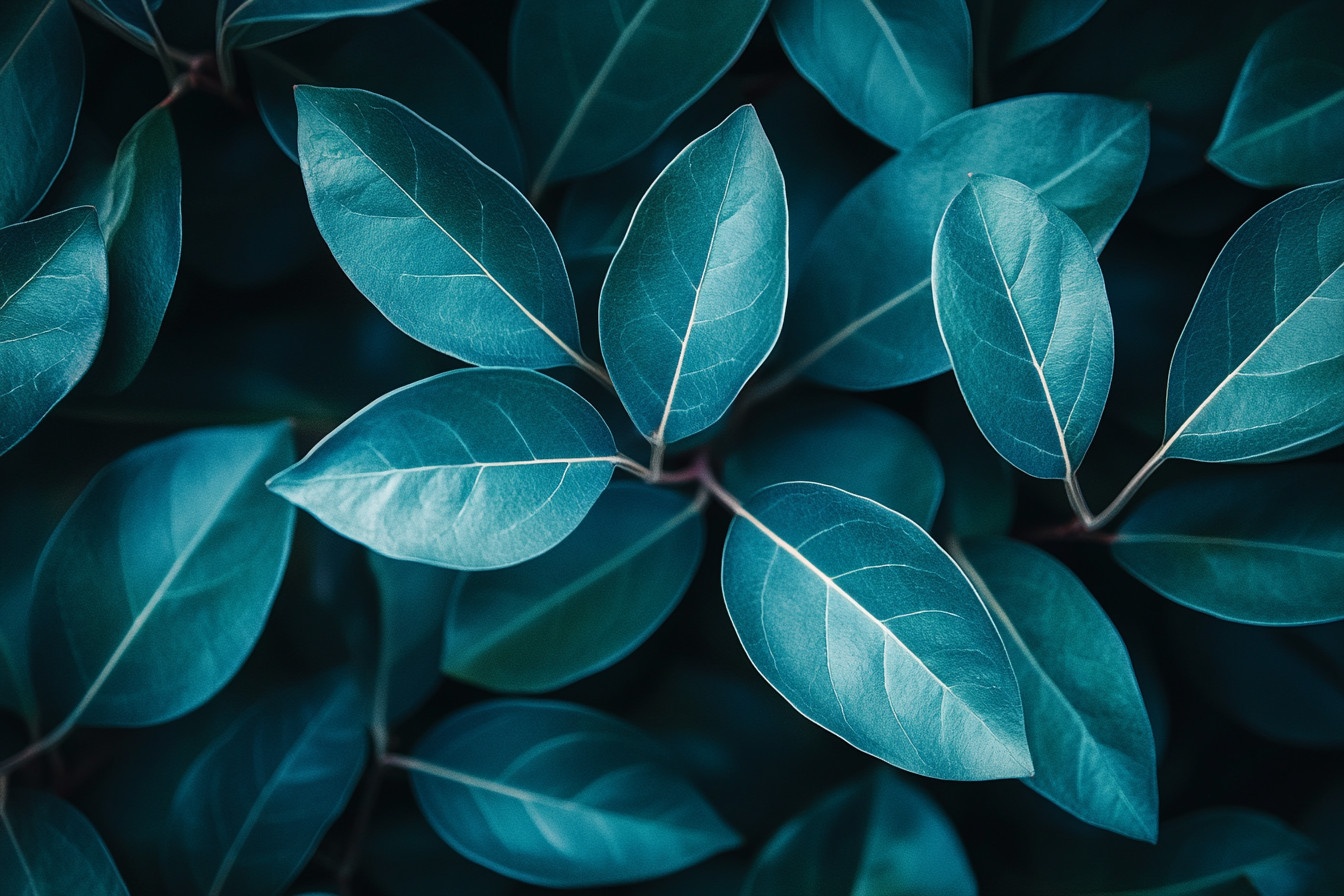
I remember spending an entire afternoon last spring sitting in Golden Gate Park, just observing how green actually appears in nature. It’s never just one shade, you know? There’s sage mixed with olive, touches of yellow-green where new growth catches light, deeper forest tones in the shadows. That observation completely changed how I approach biophilic colors in interior spaces. Instead of thinking “I need green,” I started thinking “I need the complexity of green as it exists in living systems.”
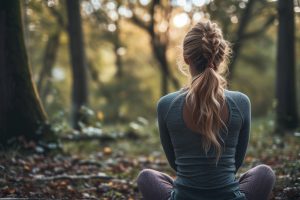
The science behind why certain biophilic design color choices affect us so powerfully is fascinating. Our brains have evolved over millions of years to respond positively to the color patterns found in healthy natural environments. When we see the soft blues of clear sky or the varied greens of thriving vegetation, our nervous systems literally calm down. Cortisol levels drop, heart rate slows, and our minds shift into what researchers call “soft fascination” – that relaxed-but-alert state that’s perfect for creativity and restoration.
I’ve been tracking my own responses to different color environments for about two years now (yes, I’m that person who keeps spreadsheets about interior design), and the patterns are remarkable. My sleep quality improves significantly when my bedroom incorporates what I call the “forest floor palette” – those deep browns, muted greens, and soft grays that mirror what you’d see looking down while walking through woods. My home office, painted in soft sage with warm wood accents, consistently correlates with my most productive writing days.
But here’s what gets really interesting about biophilic color palettes: they’re not universal. The specific hues that create the strongest nature connection vary based on the landscape you grew up with. People raised near coastlines often respond most strongly to biophilic blue tones and sandy beiges. Those from mountain regions tend to gravitate toward stone grays and evergreen colors. I grew up in the Pacific Northwest, so my ideal biophilic colors lean heavily toward the deep greens and rich browns of old-growth forests.
Understanding your personal landscape connection is crucial when developing a biophilic design color palette for your space. I always ask clients to think about the outdoor environments where they feel most at peace. Is it the beach at sunset? A meadow in spring? A desert landscape? The answers guide our color selections in ways that generic “nature-inspired” palettes never could.
Green remains the foundation of most biophilic color schemes, and for good reason. Our eyes actually have more receptors for green wavelengths than any other color – another evolutionary adaptation that helped our ancestors identify healthy vegetation and safe water sources. But not all greens work equally well in interior spaces. I’ve found that slightly grayed or muted greens create better balance than pure, saturated versions. Think eucalyptus rather than kelly green, sage rather than lime.
The key with green in biophilic design is understanding its emotional temperature. Cooler greens with blue undertones create calming, contemplative spaces perfect for bedrooms or meditation areas. Warmer greens with yellow undertones energize and inspire, making them ideal for creative workspaces or kitchens where you want people to feel lively and engaged.
I recently helped a friend redesign her therapy practice, and we chose a particular shade of blue-green that reminded her of swimming in mountain lakes as a child. Her clients started commenting on how different the space felt – more peaceful, more trusting. That’s the power of getting biophilic colors right. They work on levels below conscious awareness, creating emotional responses that enhance the space’s intended function.
Brown often gets overlooked in discussions of biophilic color palettes, but it’s absolutely essential. Brown grounds other colors the way soil grounds a forest ecosystem. It provides stability and warmth that prevents nature-inspired spaces from feeling cold or detached. The trick is choosing browns with enough complexity to feel alive rather than muddy. I look for browns with red undertones (like rich chocolate or warm chestnut) or those with slight gray influences that echo weathered wood or smooth river stones.
Biophilic art can be an incredible way to introduce sophisticated color relationships into a space. I collect photography and paintings that capture the subtle color gradations you see in natural settings – the way morning light shifts from golden to silver, how water reflects and refracts surrounding colors, the infinite variations in a single leaf. These pieces become both color inspiration and emotional anchors in designed spaces.
Water colors deserve special attention in biophilic design. The blues and blue-greens associated with clean water trigger deep psychological responses related to safety and abundance. But again, it’s about complexity. Real water is rarely a single blue – it contains reflections of sky, surrounding vegetation, and mineral content that create subtle color variations. I use these nuanced water colors as accent tones rather than dominant hues, letting them catch light and create movement within a more grounded color palette.
Seasonal color changes are something I’m becoming increasingly interested in as I develop my understanding of biophilic design color palette strategies. Nature doesn’t maintain static color relationships – forests shift from spring greens to summer’s deep emerald to autumn’s gold and crimson, then winter’s subtle grays and browns. I’m experimenting with ways to incorporate this temporal element into interior spaces through changeable textiles, rotating artwork, and even adjustable lighting that shifts color temperature throughout the year.
Lighting plays a huge role in how biophilic colors actually appear in your space. Natural light changes constantly throughout the day, revealing different aspects of color that artificial lighting often flattens or distorts. I always test color choices under various lighting conditions – morning sun, afternoon shade, evening artificial light – to ensure they maintain their nature connection regardless of time or weather.
The psychological impact of getting biophilic colors right extends far beyond simple aesthetic pleasure. I’ve worked with families whose children’s behavior improved dramatically after introducing calming nature-inspired colors to bedrooms and play areas. Office workers report feeling less stressed and more creative in spaces that incorporate sophisticated biophilic color palettes. Even my elderly neighbor mentioned that her new living room colors (soft sage walls with warm wood furniture) made her feel more energetic and optimistic.
Material selection is as important as pure color choice when creating authentic biophilic color relationships. Natural materials like wood, stone, and fiber display color differently than synthetic alternatives. They absorb and reflect light in complex ways that add depth and interest to color palettes. A piece of weathered cedar brings browns and grays that no paint color can fully replicate. Natural linen contains color variations that make solid-colored synthetic fabrics look flat by comparison.
I’m also fascinated by how traditional cultures used biophilic color principles long before we had terms for them. Japanese architecture creates sophisticated color relationships using natural wood tones, paper whites, and carefully selected accent colors that echo seasonal changes. Southwestern adobe buildings incorporate the exact earth tones of their surrounding landscape. These vernacular approaches to color offer incredible inspiration for contemporary biophilic design.
One thing I’ve learned through years of experimentation is that biophilic color palettes work best when they include both warm and cool tones, just like natural environments do. A forest contains the cool blues and greens of shadow alongside the warm golds and browns of sunlit bark and earth. This temperature balance prevents spaces from feeling monotonous or emotionally flat.
Texture plays into color perception in ways that are particularly important for biophilic design. Rough textures make colors appear darker and more grounded, while smooth surfaces reflect light and brighten colors. I use this principle to create visual interest within limited color palettes – varying texture to create the kind of subtle complexity you see in natural settings.
The future of biophilic color palette development is moving toward more sophisticated understanding of individual responses and cultural connections to landscape. What works in a Seattle apartment might not translate to a Miami condo or a Denver loft. Regional plants, geological features, and climate patterns all influence which colors feel most naturally “right” in a given location.
As I continue exploring biophilic color relationships, I’m struck by how much we’re still discovering about the intersection of color, emotion, and our innate connection to natural systems. Every project teaches me something new about how subtle color choices can dramatically impact the way spaces feel and function. The goal isn’t to recreate nature exactly, but to capture its essential emotional and psychological qualities through thoughtful color relationships that honor our deep biological need for natural connection.